15 Practical Interior Decorating Secrets You Need to Know
I'm so excited to share this post! I scoured blogs, articles and even some books looking for practical interior design secrets from some of my favorite interior designers. I also included the links to the source of each quote. Most of the quotes are snippets from entire articles, so I suggest you click through because I guarantee there's a lot more to digest. So, without any further adieu:
15 Practical Interior Decorating Secrets You Need to Know
Tell A Story
"A space should tell a story. Seek out pieces that mean something to you personally, whether it’s a special souvenir found traveling on an amazing vacation, or photograph of a favorite musician. No detail is too small. Elevated, thoughtful and everyday items like bar accessories punctuate a space with passion." - Kelly Wearstler
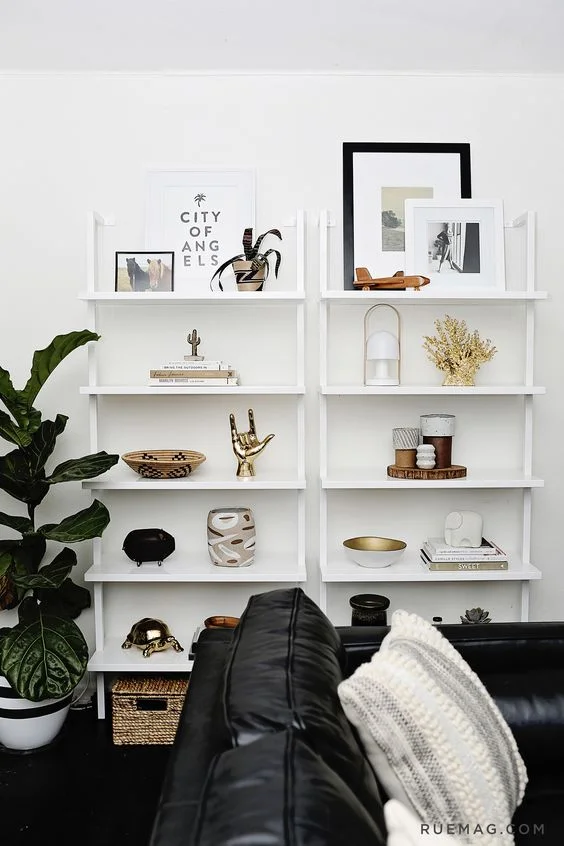
Ann Sage House Tour for Rue Mag The items on the bookcase are grouped in 3's. There are a few exceptions, but this theory works really well here.
Group Things in 3's
"The eye loves to pick up on pattern[s], and three is the smallest number of elements required to create one. Grouping items like vases and statues together in groups of three makes shelves look artfully arranged." - Justina Blakeney
Accessorize with Color
"For those of you who are still slightly color-phobic, here’s a fail-proof recipe: stick with neutral colors & traditional shapes for all of your main pieces (sofa, rug, end tables, etc.), then infuse the space with color by adding bright accessories. This way you can easily change your color palette by making quick & easy changes to your art work and accent pillows." - Dayka Robinson
Use Texture
"Mix hard, soft, rough and natural elements. Combining these unexpected pieces is the designer’s secret to creating a vignette with textural interest." - Erika Ward
Put Words To How You Want Your Home to Feel
"Decide how you want your space to feel, not just look. Knowing how you want it to feel and putting words to those feelings will help guide you through the whole process. If you want it to feel calm, quiet and serene then that is a pretty different direction from energetic, sophisticated and fun. So think about walking in your door and the emotions or adjectives that you want the space to evoke in you." - Emily Henderson (Pssst! Read My Find Your Interior Design Style Post here)
CREATE A PERSONAL CHECKLIST OF WHAT MATTERS TO YOU
If you love the light, then make sure you place furniture close to windows to enjoy the view. If you are always in the kitchen, make sure it is a place where friends can hang out too, and if you enjoy a sense of space, think about banishing the walls in favor or sliding screens or transparent doors. - Holly Becker and Joanna Copestick via Decorate
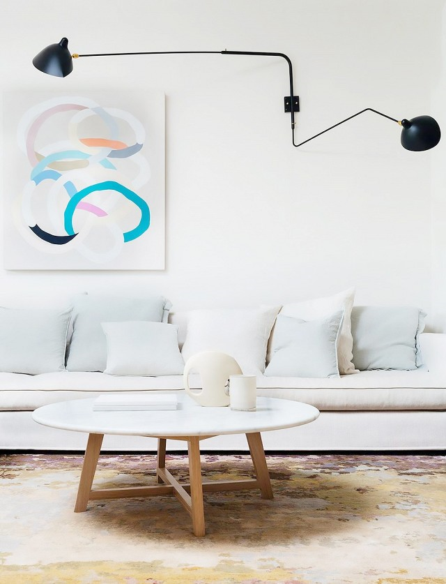
Arent&Pyke via My Domaine The art in this living room space contrasts the otherwise very neutral palette.
Art for Contrast
"Art doesn’t have to be [a] driving force, but it IS a strong influence. Art is [a] great way to contrast, soften, add color, add graphic emphasis. You can use art to get more serious, or get a little cheeky. Design for me is always a bit of a balancing game. Adding a bit more traditional to a modern space, a little bit of rustic to soften a glamorous one, etc. A little thing like a picture on a wall can totally sway the vibe of a space." - Naomi Stein
Dark Walls in Small Rooms Works
When it comes to small-space decorating, the common advice is to go all-white on the walls to reflect the most light and make the space feel bigger...While white is an easy and versatile base, the way that light interacts with white can be very static — there are no subtleties in its hue because it reflects all the colors at once. This is where the dynamic color of a dark shade gets interesting: as the light in a room changes throughout the day, so does a dark wall color. Even black can have cool or warm undertones. - Kevin O' Gara via Design Sponge
Buy What Fits Your Budget, Replace Later
Buy the best that you can, and slowly replace the budget items with better ones. - Bunny Williams via Domino Magazine Winter 2015
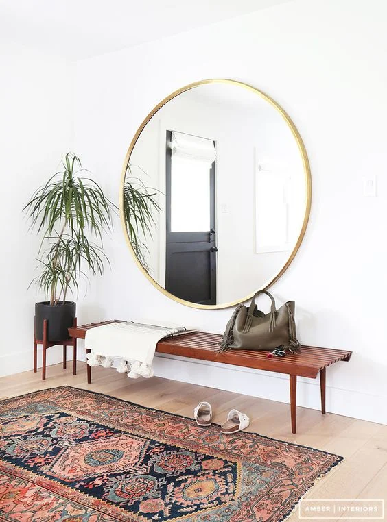
Project Reveal via Amber Interiors This entry vignette is very inviting. We can refer to this as a moment of cool.
Create Vignettes for Rhythm
Creating vignettes around the house is a cool way to curate different kinds of objects and help(s) create a rhythm for the space. - Mark Jay Freedman via Domino Magazine Winter 2015
Mix Your Collectibles When Styling Shelves
"Start by putting more objects than you think you need on the shelves, then step back and edit. If you want to mix your collectibles in with books, try to stay away from placing pairs of things - such as vases or bookends - next to each other. This will help to keep your shelves from looking forced." - Lauren McGrath via Good Bones, Great Pieces
Create a Moody Home
A moody home has a strong narrative and layers that reflect the multifaceted personality of the resident...How do you achieve this sense of soul in a home? Not just by lighting some scented candles, painting your bedroom sky blue, or buying all mid-century modern furniture. Some of my styling tips are to create layers through textiles and fabrics, to avoid overly homogeneous theme, to showcase your cherished objects and art, and to keep collecting new things. But most of all it's about confidence! Trust what you like, and don't worry if other people don't approve. Let your inspirations guide you, since those are usually indicators of the narrative that resonates most for you. - Lili Diallo via Details
SCALE is important when mixing patterns
The biggest fear in mixing patterns is clashing, but understanding scale can make this fear completely irrelevant. When you are choosing materials/fabrics for your space, the best beginner tip I can give you is to choose one large scale pattern and one small scale pattern. The idea is to create a cohesive look. Two or more large-scale patterns can create confusion for the eye. Two or more small scale patterns can cancel one another out. - Sentrell Marsh via Mixing Patterns Like A Pro
The Principles of Arranging
Scale, shape, color and, content (inanimate objects capacity to communicate meaning) are tried and true ingredients for composing objects and furnishing vignettes...Artful design is all in the balance. For arranging, this mean juxtaposing silhouettes and colors, and even ideas and concepts against each other...Start by establishing framing. Item in a room or on a surface should be composed as you would paint a canvas, with scale, sequencing, and balance conceived from one specific vantage point. - Jonathan Adler via Happy Chic Accessorizing
Drapes Should "Kiss" The Floor
The length of your drapes ... is one thing most designers agree on: They should “kiss” the floor. A rookie move would be to have them hit the window ledge or fall somewhere between the bottom of the window and the base of the floor. If you want to get super romantic with silk curtains, you can go for a glamorous “puddling” of extra fabric, but otherwise they should just meet the floor. - Julia Millay Walsh via My Domaine


